

Chart Types
A brief overview of the various chart types is provided below.
| Chart Type | Example | Description |
|---|---|---|
| Single Axis Charts | ||
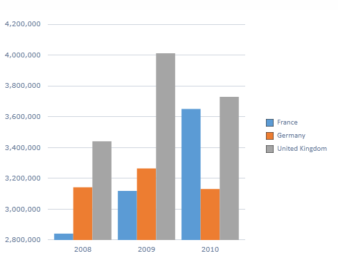
| Column |
|
Default chart type. Each series value shown in separate column. |
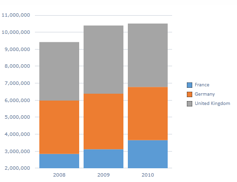
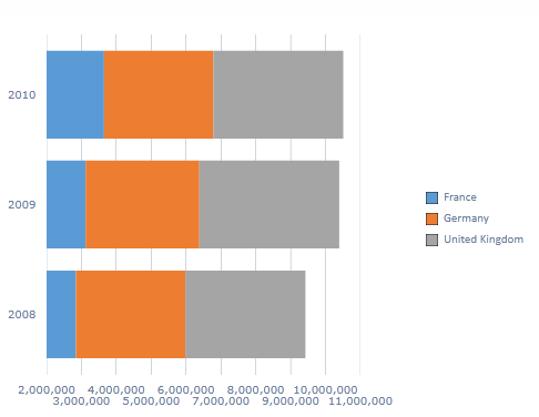
| Stacked Column |
|
Shows accumulated series values based on ABSOLUTE totals. |
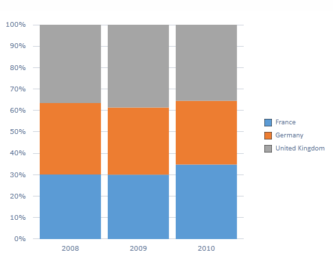
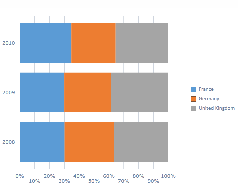
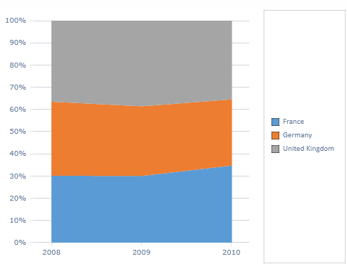
| Stacked Column 100% |
|
Shows accumulated series values RELATIVE to 100% totals. |
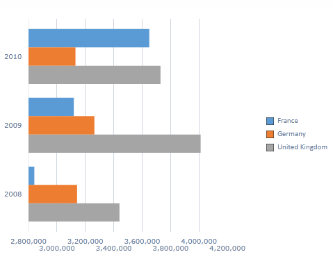
| Bar |
|
Horizontal bar chart. |
| Stacked Bar |
|
Shows accumulated series values based on ABSOLUTE totals. |
| Stacked Bar 100% |
|
Shows accumulated series values RELATIVE to 100% totals. |
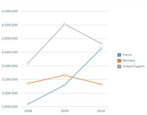
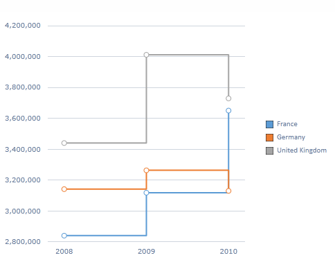
| Line |
|
Displays information as a series of data points (markers) connected by straight lines. |
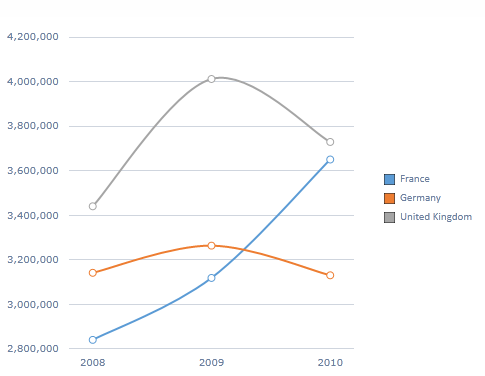
| Spline |
|
Displays information as a series of data points (markers) connected by curved lines. |
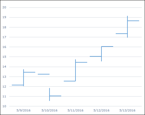
| StepLine |
|
Displays information as a series of data points (markers) connected by straight lines. Step-like visuals are added between any two points that have differing values. |
| Pie |
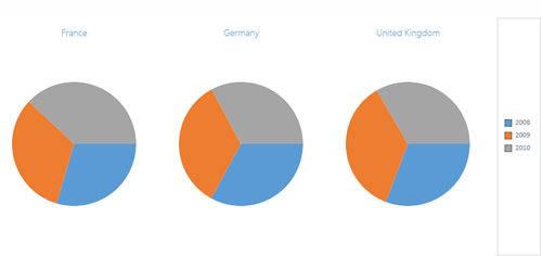
|
Show series as individual pies, and categories as pie segments. Automatically represented in multi-chart format. |
| Doughnut |
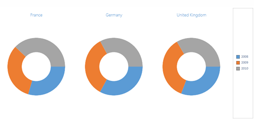
|
Show series as individual rings, and categories as ring segments. Automatically represented in multi-chart format. |
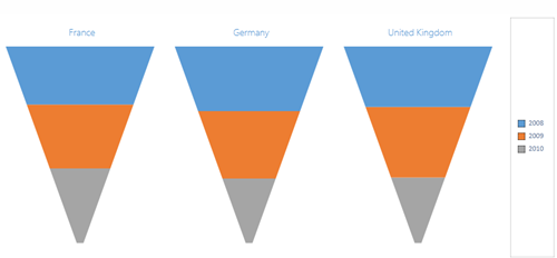
| Pyramid |
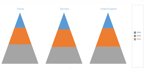
|
Show series as individual pyramids, and categories as pyramid levels. Automatically represented in multi-chart format. |
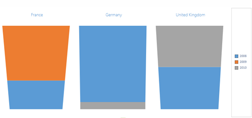
| Section Funnel |
|
Show series as individual funnels, and categories as funnel levels. Automatically represented in multi-chart format. |
| StreamLine Funnel |
|
Show series as individual funnels, and categories as funnel levels. Automatically represented in multi-chart format. NOTE: A streamlined funnel chart cannot be viewed with a single data point. |
| Area |
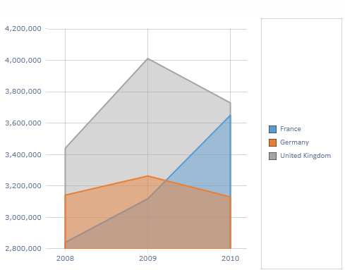
|
Each area item is "stacked" laterally on the chart. NOTE: The best way to view a plain area chart is usually in 3D mode with transparency. |
| Stacked Area |
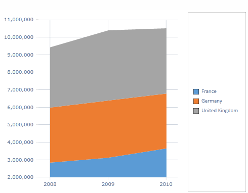
|
Shows accumulated series values based on ABSOLUTE totals. |
| Stacked Area 100% |
|
Shows accumulated series values RELATIVE to 100% totals. |
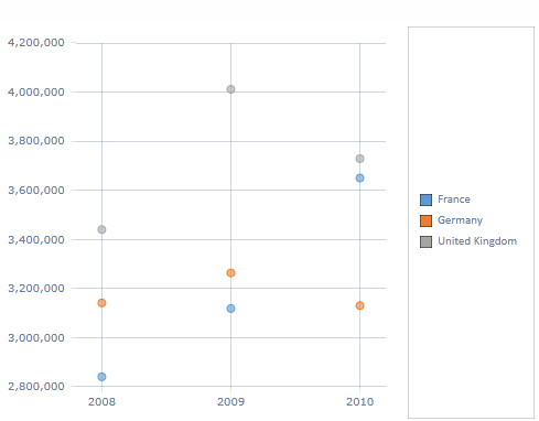
| Point |
|
Displays information as a series of data points (markers). |
| Multi-Axis Charts | ||
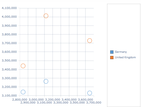
| Scatter |
|
Scatter plots use the first two columns of a query to plot the x and y axes (and then every subsequent column). The rows of the query, which are typically used as the basis for the categories of a chart, are only displayed as data points in the plot. See Multi-Axis charts for more info on scatter charts. NOTE: A scatter plot chart cannot be viewed with a single column of data. |
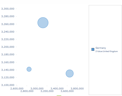
| Bubble |
|
Bubble charts use the first three columns of a query to plot the x, y and z axes (and then every subsequent set of two columns). The rows of the query, which are typically used as the basis for the categories of a chart, are displayed as data points in the plot. See multi-axis charts for more info. NOTE: A bubble plot chart cannot be viewed with fewer than three columns of data. |
| Circular Charts | ||
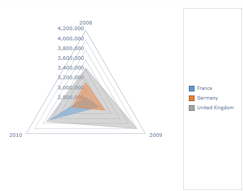
| Radar |
|
Draws an area chart on the basis of a 360 degree plane, which has been subdivided into arcs equivalent to the number of data categories in the result set. |
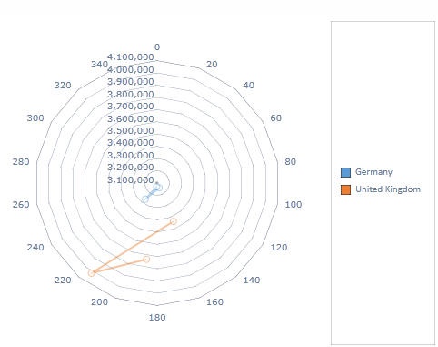
| Polar |
|
Draws scatter plots using a 360 degree Cartesian plane. Polar charts require at least two columns of data (like scatter plots). |
| Other Charts | ||
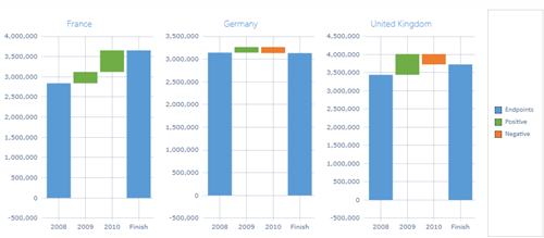
| Waterfall |
|
Waterfall charts demonstrate how an initial value is influenced by a series of intermediate (positive or negative) values. Three distinct colors are used to indicate endpoints, positive values and negative values. |
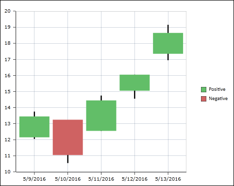
| Candlestick |
|
Candlestick charts require four data points representing high, low, open and close values. |
| Stock |
|
Stock charts require four data points representing high, low, open and close values. Stock charts are similar to candlestick charts, but use simple lines instead of candlestick icons. |
Home |
Table of Contents |
Index |
User Community
Pyramid Analytics © 2011-2022